Method and Implementation Turnover Dashboard (Power BI)
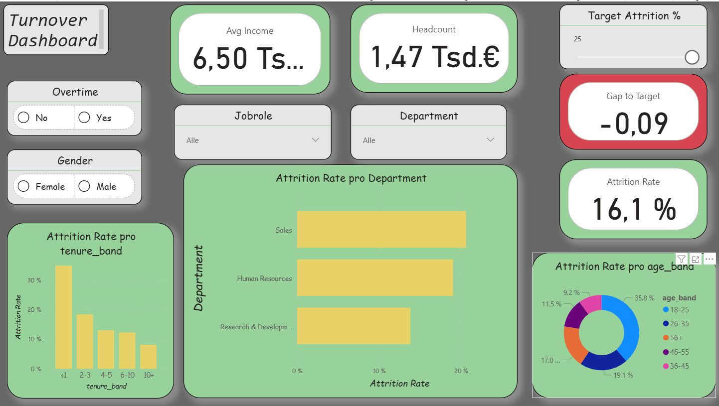
The practical implementation of the first dashboard (Overview) aimed to make employee turnover visible while simultaneously integrating agile elements. The intention was to demonstrate how a functional HR dashboard can be developed with manageable effort. The process consisted of three parts: data preparation (ETL) in Python, the construction of a clear data model in Power BI, and the visualization of the most important key figures. In addition, I incorporated agile functions: a What-If parameter (“Target Attrition %”), the metric Gap-toTarget, a simple Risk Score, and a status card with warning indicators. As a result, the dashboard was iteratively extended and corresponds to the first sprint.
Data Preparation in Kaggle
As a data source, I used an open HR dataset from Kaggle. This contained employee information such as age, income, department, or attrition status. In a Kaggle notebook, I performed basic data cleansing steps using Python (Pandas and NumPy).
https://www.kaggle.com/code/lrhmanelliverdiyev/turnover-seminararbeit-u- akademeiThis included:
- Standardizing column names for easier further processing
- Converting relevant variables into categories
- Creating age, tenure, and income bands
- As well as creating flags, for example for attrition (0/1) and overtime (0/1)
The result was a cleaned file hr_clean.csv, which served as the basis for Power BI. It is important to note that Kaggle was used exclusively for data cleansing, the visualization was carried out later in Power BI.
ETL Process (Practical Procedure)
For my work, I prepared the HR data using a simple ETL process in Power BI. First, I imported the raw data from an Excel or CSV file into Power BI. Then I renamed the column names so that they were clear and consistent, for example “EmpID,” “Attrition,” or “OvertimeHours.” After that, I adjusted the data types, meaning whether they were numbers, text, or date values. In the next step, I cleaned the data. This means that I removed or corrected missing or incorrect values. Afterwards, I created new variables, for example a flag “Attrition = 1,” to clearly see which employees had left the company. In addition, I grouped certain attributes, for example salary classes or age groups. This makes the data easier to compare.
The data model was also very important. For this purpose, I built a star schema that shows the connection between fact and dimension tables. Finally, I loaded the data into the model and was then able to create the visualizations and analyses in the dashboards.
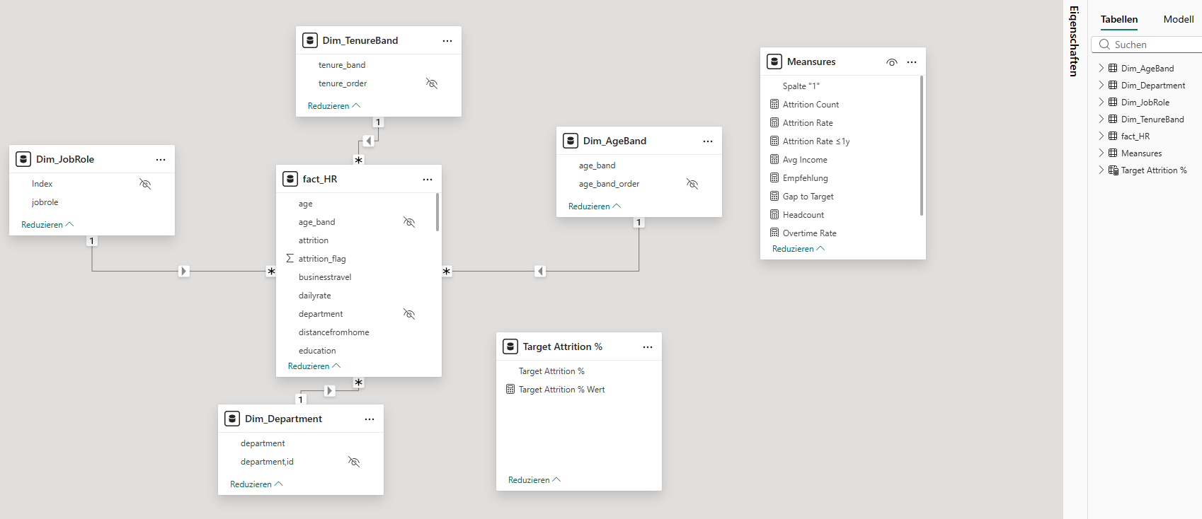
Data Model in Power BI
After importing the cleaned CSV file into Power BI, I built a star schema. The central fact table (Fact_HR) contains all employee data. In addition, I created dimension tables, for example Dim_Department, Dim_JobRole, Dim_AgeBand, Dim_TenureBand, and Dim_IncomeBand.
The relationships were created as (1: n). For the age and tenure bands, I inserted helper columns for sorting, whereby the order had to be adjusted manually in some visualizations. This approach makes the model clear and at the same time flexible. There is also a small table _Measures. It is deliberately created without relationships and serves only as a container for all DAX measures. The placeholder column is hidden; only the measures are visible in the report. This keeps the model clear and still flexible.
Key Figures (DAX)
For the analysis, I calculated central key figures using DAX. These include:
- Headcount = Total number of employees
- Attrition Count = Number of employees who have left
- Attrition Rate = Ratio of employees who have left to total employees
- Overtime Rate = Proportion of employees with overtime
- Avg Income = Average monthly income.
These key figures enable both an overall overview and detailed analyses by departments, roles, or employee groups.
Report Pages in Power BI
Das Dashboard besteht aus drei Seiten.
Overview: In addition to the central key figures (Headcount, Attrition Rate, Overtime Rate, Avg Income), agile extensions were integrated. These include a What-If parameter for the attrition target, the key figure Gap-to-Target, a simple Risk Score, and a status card. In this way, turnover is not only described but also compared with target values and linked to risk indicators.
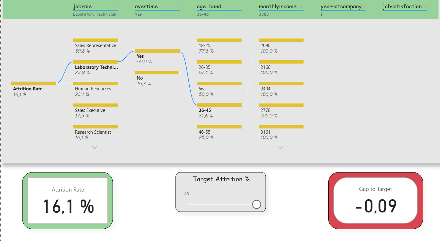
Deep-Dive (Decomposition Tree): Here, the attrition rate could be broken down step by step according to various influencing factors (e.g., department, overtime, income, tenure). Slicers were deliberately reduced in order to keep the analysis freely exploratory. In addition, two small KPIs (Attrition Rate and Gap-to- Target) remained visible to that the target values were not lost. This clearly reflects the agile idea of interactive exploration.
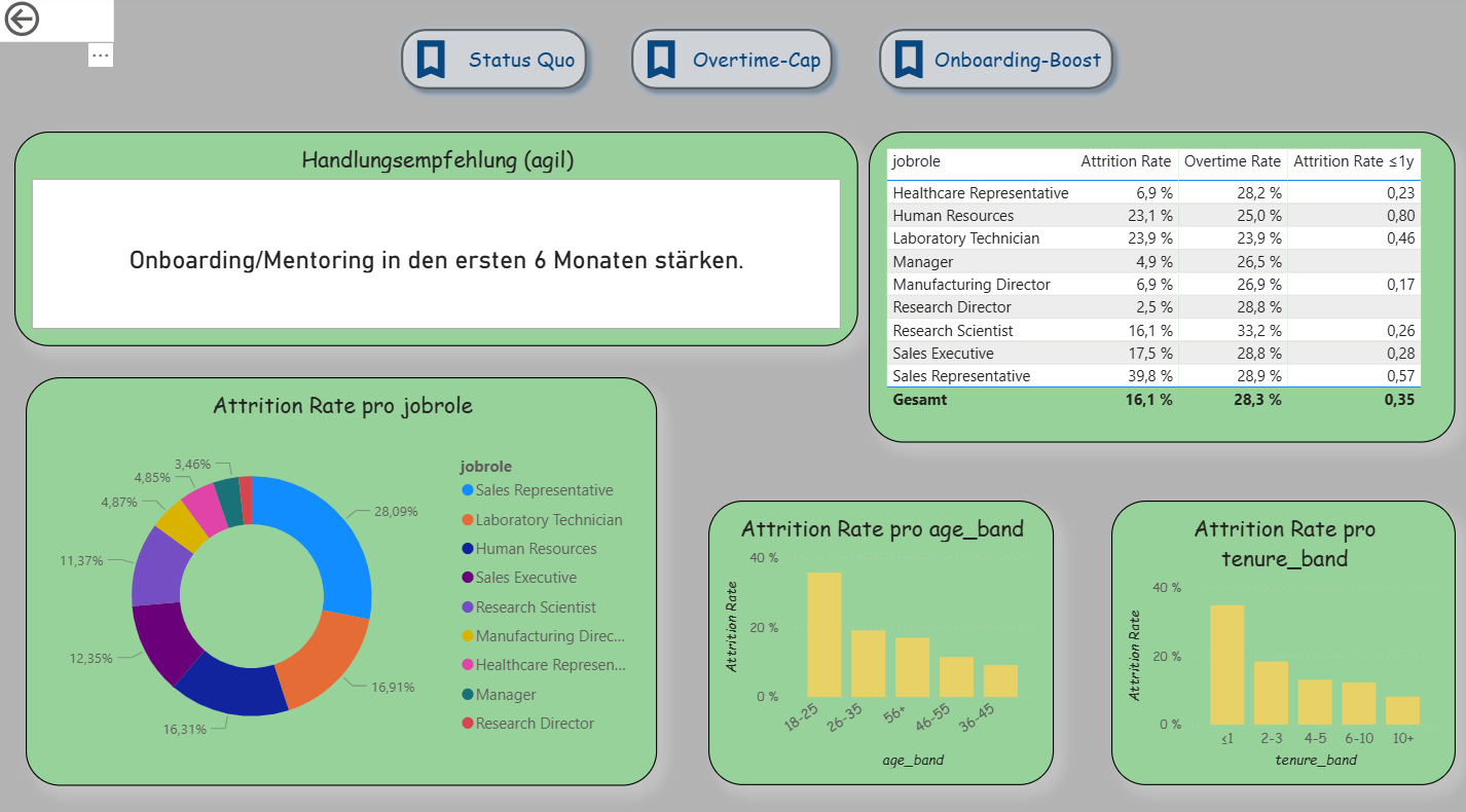
Decision Support (Extended Drillthrough): The third page was expanded into an agile decision dashboard. In addition to detailed analyses per department, it contains three scenario buttons (Status Quo, Overtime-Cap, Onboarding-Boost) that simulate different situations. A recommendation card automatically provides suggestions (e.g., limit overtime, strengthen onboarding). A table shows the top 5 risk roles based on the new measure “Risk Score.” Demographic visualizations (age, tenure) immediately adapt to the selected scenario. This makes this page the clearest example of Agile BI.
Descriptive Results
The dashboard shows typical patterns of employee turnover that are also described in the literature. Younger employees (e.g., in the age band 18–25 years) and individuals with short organizational tenure (≤ 1 year) have a significantly higher exit rate. The risk likewise increases when overtime is regularly performed. Job roles in the Sales area are particularly affected.
What was new here was that the results were not only visible descriptively but were also connected with agile elements. With the What-If parameter, a target value for turnover could be set, and the Gap-to-Target metric immediately showed the deviation between actual and target. The simple Risk Score combined factors such as overtime, tenure, and income, thereby making risk segments clearly recognizable. In this way, a purely descriptive analysis became an agile instrument that not only identifies patterns but also opens up scope for decision-making .